all data is live and searchable
« Back .
[Adilas youtube training videos for me] .
[Adilas steps to success - user guide (under construction)]
. [Adilas "quick search" help]
[Adilas university] . [all Adilas help files] . [developer's notebook] . [Adilas web/api documentation] . [contact Adilas support - email form]
[online glossary] . [presentation gallery - outline]
[Adilas university] . [all Adilas help files] . [developer's notebook] . [Adilas web/api documentation] . [contact Adilas support - email form]
[online glossary] . [presentation gallery - outline]
![[all business functions - core layout]](images/help/adilas_gps_layout_all_business_functions.jpg)
|
Adilas GPS Core Layout - World Building Concepts
|
|
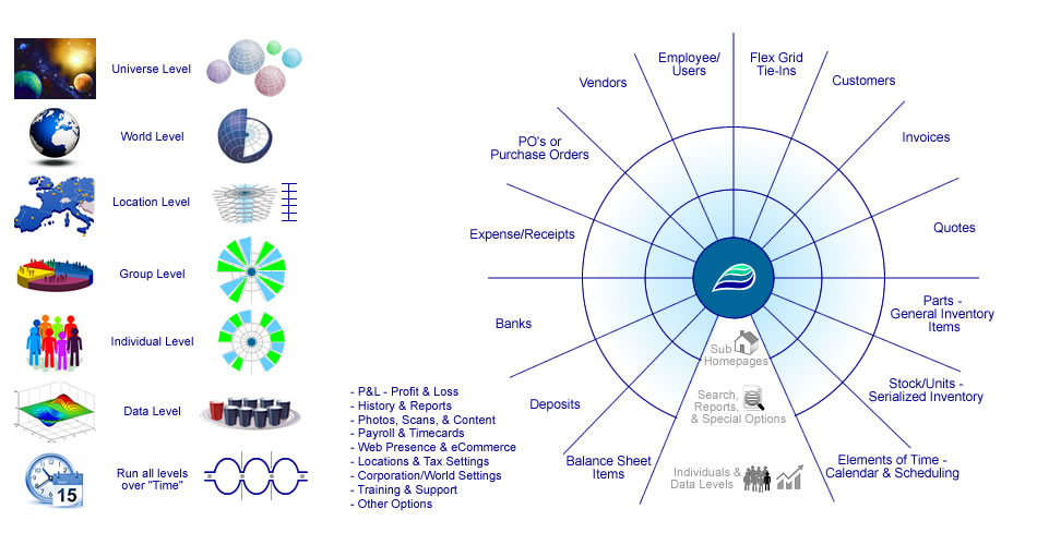
This help file shows the organization of the Adilas system as well as world building concepts. It is called the Adilas GPS core layout. Currently, this interface is a graphic with buttons overlaid on it to allow for navigation. There has been a lot of thought put into this graphic and the placement of the different pieces. It is both a navigational tool as well as a system level teaching asset. Sometimes this graphic is used to introduce new users to what we are building and offering in order for them, or their company, to build their own business world.
The GPS core part of the interface is the part on the right that shows all of the main system or application players (sections within the system). It is organized into a data sphere (globe or planet) type layout, where there are multiple ways around the system and everything interacts with the other parts and pieces. The name GPS core explains two main concepts of this navigation system. 1. The system is setup like a hub or core shot of a world, or planet, with orbs, rings, and levels. Hence the word "core". 2. The GPS (global positioning system) part deals with - Where am I? What are my options? Where can I go? Where should I go from here? When you put it all together, you get the Adilas GPS core layout interface. The section on the left is dealing with the world building concepts and levels. Think of universe levels clear down to the smallest details, all of which take place over and through time. These become the pieces that interact, stack, and layer to get the full world building story. We will introduce and explain the world building concepts and how they relate to options that are available to you and your company. The world building concepts and levels are:
Next, we are going to go from top to bottom on the left side and talk about each layer or section. As an overview, there are a number of small graphics that deal with each layer. One is on the world building side (left) and the other is on the system or application side (right). At the top, it shows a small graphic stating the phrase "3D World Building and then shows a small world inside of a box with labeled axes. The three different axes are: X axis = time (horizontal - going from past, present, to future), the Y axis = resources or money (vertical - resources going up and down), and the Z axis = space (data depth, layers, or sub states). 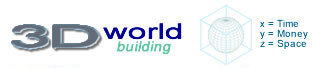
The universe level shows multiple planets. This is the big picture view of different worlds, galaxies, clusters, solar systems, etc. Each one of those worlds is basically a representation of a business, or a business world. Each one is different - size, color, shape, industry, vertical, purpose, and make-up. These worlds could either be multiple businesses that you own and/or businesses that others own or control. Once again, this is at the universe level. 
The world level is below the universe level. The layout shows a globe/world and also a world with a section removed, showing a core. Each world is what we call a corporation inside the system. This is where most companies start interacting with the application. This is where they are capturing their data and usage. For us, it was important that we show a cross section of the core to indicate the next levels that are within the world. This cross section was meant to refer to the entire right-hand side of the interface/graphic and what it deals with. That whole section with the rings, orbs, layers, and key application players make up the core. The layout is showing that the inside of each world has all of the pieces that make up the whole Adilas system. We will keep going deeper into how these levels interconnect and operate. 
The location level follows the world level. Just like our world is organized into countries and locations, your world will need some kind of organizational structure. This layer shows a map of a geographical location on the left, along with a stacked or layered image on the right. This deals with depth and can be compared with how many locations, real or virtual, are needed. At least one location is required to run the system, but technically, the whole model will stack depending on the number of locations. The stacked visual is meant to represent a number of cores layered on top of each other. This is to help you imagine that a world could have multiple locations, and each of those locations have full functionality of the core elements. 
The group level comes next. This shows a couple of small graphics including a pie chart with different colors and groupings, and a core shot with pie pieces highlighted. Behind the scenes, we call these groups, or groupings, the application players. There are 12 known groups. These groups are noted, around the outside of the core shot on the righthand side of the graphic. To navigate to any of these sections or homepages, simply click on that section of the core graphic. They are:
As a note, there are two other main categories that are shown on the outer rim of the core shot that are not part of the 12 main application players. They are the Flex Grid Tie-Ins and Banks. The flex grid tie-ins are a deep connection and special relationship tool. If you want more information on the flex grid, please see this help file. The banks combine the deposits and expense/receipts to help record money flow. Both of these other special options, flex grid tie-ins and banks, are joiner or combination tools or pieces. All application player types, along with these special joiner pieces, are unlimited in number and usage. These pieces make up your group level. 
After the group level comes the individual level. This is where each main group can hold its information and details. This is where you start getting into individual pieces of the puzzle. For example: You may have hundreds or thousands of deposits, millions of invoices, etc., etc. Each of these groups may have an unlimited number of records. The two world building graphics for this section show individual persons standing close together, and a core shot with just the outside edges highlighted to show the individual levels of each group. Going back to the people graphic, each one is individual, just like in our world. In the system, each individual within a group will be different. Such as each invoice or PO will be different, even if you have thousands or millions of them. They become an object or a container for data. Without getting super technical, each object with its individual data gets assigned to a group, gets a number/id, a location, and starts its lifecycle. At this individual level, you start talking about your objects based on type and number/id. For example: Customer 555, Vendor 312, User 272, Invoice 8735, etc. 
The next layer is the data layer. This layer shows a couple of graphics to help talk about data and where things are stored. The graphics are a 3D chart/graph on the left and a plate with some cups/containers on the right. Because this level gets so deep, we will spend more time explaining some further details lower on the page. At this point, you are getting into actual database records. Each record is stored in the database, assigned id numbers, and linked or joined to other database records. We call this a relational database model. Without getting too technical, you start getting into one-to-many type relationships. For example, a single invoice may be connected to a customer record. The same invoice is connected to one or more line items. Each line item is connected to inventory items (usage). That same invoice may have one or more payments. Those payments may end up being put on one or more deposits, etc. It can get really deep here at the data level. These are the underlying pieces or parts of the story, as they play out. Things happen and connect over time. That leads into the lower or lowest level - time. 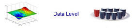
Run all levels over "Time". This layer has two small graphics to help talk about time. One of the graphics is a clock with a calendar page in front of it. The other graphic is a shape that looks like a number of pods or flex bubbles. This shape is a mini representation of a data assembly line. It is beyond the scope of this help file to describe the entire data assembly line, but here is a condensed explanation. The graphic is showing two lines running in parallel. The top line is your operations; the bottom line is your accounting. Ideally, they are perfectly parallel or in sync. But in the real world, as things happen over time, the model needs to flex, creating small pods or flex bubbles. Data flows into the pods and is only allowed to advance if a checkpoint requirement is fulfilled and the two lines come back in sync. Each piece of data may flow through multiple checkpoints. As it flows through the different checkpoints, the data is flagged, dated, and timestamped. This creates a rolling history of where it was and who advanced it. The data will stay in a state of flex as long as needed, until the next requirement or checkpoint is approved. At that point, the data is able to advance to the next stage of its lifecycle. The vertical lines in the graphic represent permissions and indicate who is authorized to advance and approve the data to move to the next level. Not everyone in the company has the same permission access. This helps control who can advance the data along its life cycle. In summary, a data assembly line tracks the data object, and all of its pieces, through its entire life cycle. If you want more information about the data assembly line, see this help file. 
This "Time" level could also be described as running all objects and data through time or wrapped in time. This is one of the foundational concepts of the entire Adilas system. In the real world, everything happens over time. Without time, data becomes disconnected snapshots. With time, those same records become connected histories that show movement, relationships, cause and effect, trends, and accountability. The data becomes alive because it has context and history. The numbers alone are not enough. The story behind the numbers is what creates understanding. This is one of the main reasons the Adilas platform exists. We are working to model real-world operations in a digital environment where actions, events, and relationships can be tracked throughout their life cycles. As these activities happen over time, they create operational insight, reporting, accounting, and business intelligence. This concept is much bigger than simple record keeping. By running all objects and data through time, the system can: track histories, preserve audit trails, provide transparency, organize relationships, detect trends, summarize activity, forecast patterns, and help create a fully interconnected business system. This is what allows Adilas to function more like a living system or "world" instead of just a collection of disconnected software tools. In many ways, time is the glue that ties everything together. See this help file for more information on 3D world building concepts. 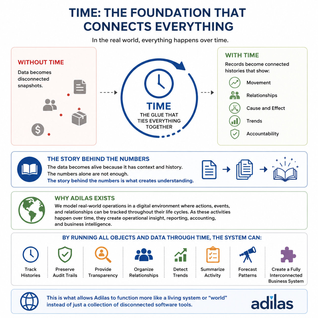
Going back to the graphic associated with the data level, we want to further explain the plate and cups analogy. The data level is at the record level or database level. We have to store each part of the transaction in its own table. Each main item, or individual object, needs a spot to hold all of its own details and information. Think of an organized set of cups or containers where the specific data can go to be held. Everything has its own place, in order to record all of the details. Above, we were giving an example of an invoice. At the data level, an invoice would need to record things such as:
It can get pretty deep, but this is how the digital storytelling is able to run over and through time. It's pretty cool when you start seeing all of the connected pieces working together to help tell the story. Here is a link to a PDF that goes over the players and object analogy - plates and cups in more detail. 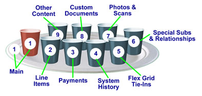
There are a number of other links and buttons on the graphic as well. Those buttons and/or sections may be clicked on to take you to that part of the system. The bottom links are there for a future project. We were calling it the "modes". The idea here was to use the same data sphere, rings, orbs, and layout to jump between different modes for each part of the system. For instance, say you wanted to see data on deposits. You click the data mode button and then the deposit section. You could do the same thing for options like permissions, settings, training, usage and stats, etc. Basically, a way to fully navigate the system based on the mode and the main player group. Currently, you may click on any of those links, but they do not switch the whole interface or relate to any specific player group. They are general navigation buttons at this point. 
Because this page is used as one of the system defined homepages, we wanted to include the information about how to reset your login attempts. If for some reason, you get locked out of the system (more than three failed login attempts), type the following address into your browser. Make sure that the reset address is entered on the computer that got locked out. After you type the address, make sure to submit the page by hitting your enter key. Nav Help - To go to this actual page inside the system, click this prompt link gps core. You can also use this same prompt or keyword in the AI quick search to get there as well. |